
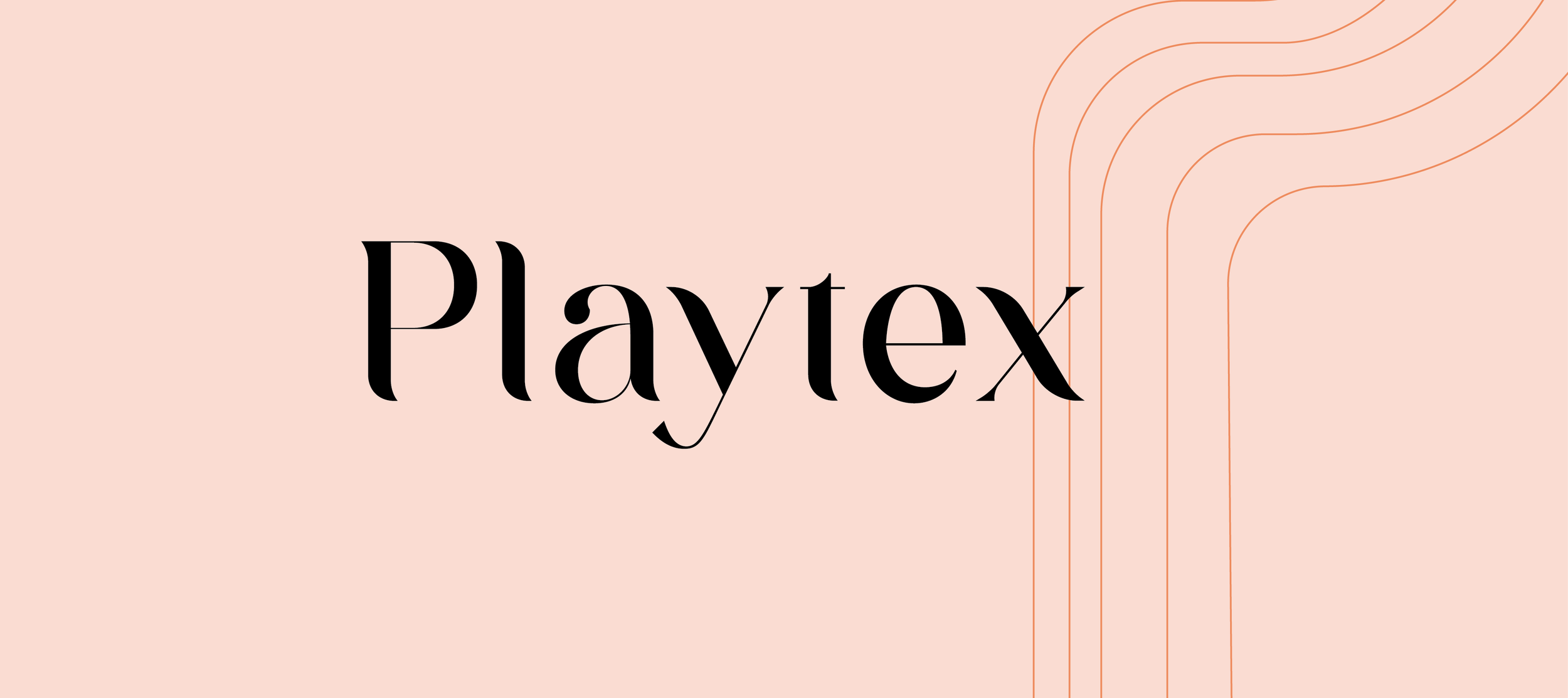
Playtex Product Design
Layout | Design | Content
Playtex is recognized for its menstrual products. In this industry, branding typically showcases a woman on the cover, leaving no doubt about the product's purpose. However, not everyone feels comfortable carrying such packaging in public or displaying it at home. With this rebranding project, my aim is to design packaging that ensures a comfortable purchasing experience both in-store and at home. To achieve this, I'll focus on creating packaging with a modern, sophisticated, and inclusive design.
Current Packaging

The Challenge
In redesigning the packaging, my aim is to craft that stands apart from the usual, implementing a sense of comfort in the consumer's choice. I'm steering clear of the typical design tropes prevalent in menstrual product packaging today.
Research & Exploration
Moodboards
To steer away from the typical imagery of a woman on the front of the packaging, I sought inspiration for my design by creating three mood boards. These boards focused on indistinct imagery that evokes a sense of calm, cleanliness, and elegance. I began exploring nature-inspired visuals, serene zen patterns, and playful shapes.

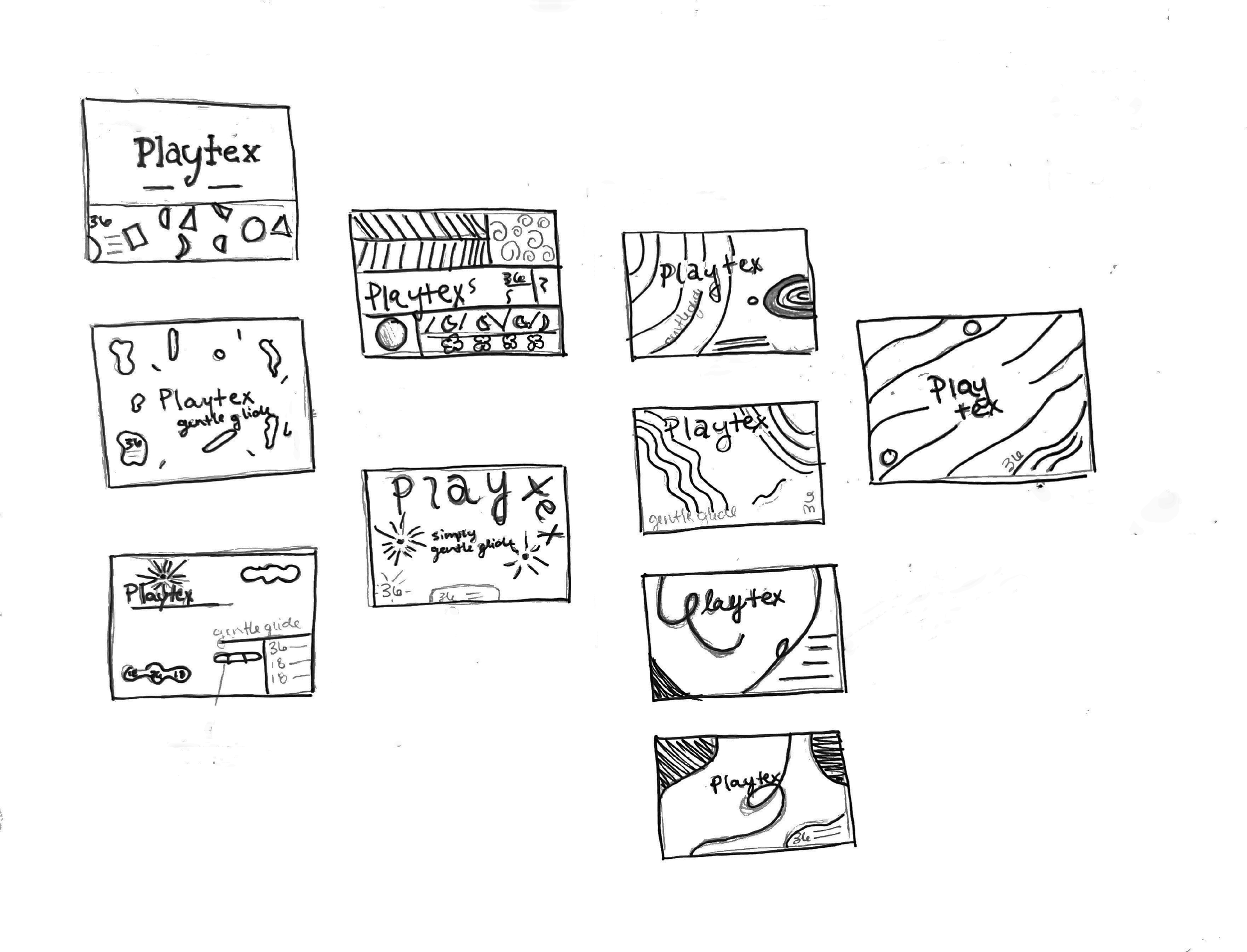
Sketches

Drawing from my research and mood boards, I started some rough sketching ideas. Using abstract lines and shapes around the brand name, I explored how to achieve the look and feeling I’m aiming for. The next step of the process was deciding which ideas were evoking this idea the best, and then into digitizing these sketches.


Digital Drafts
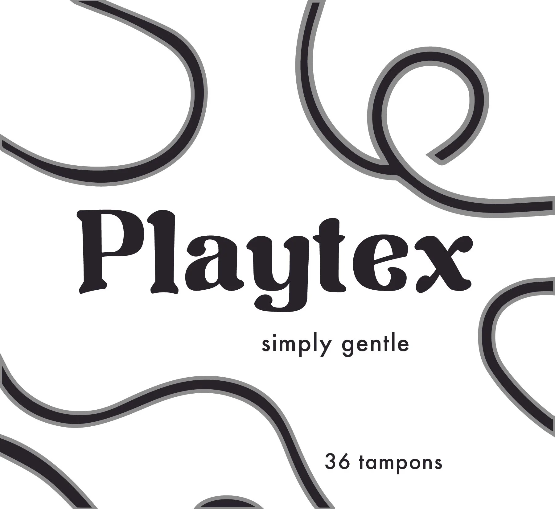
Round 1
From my initial sketches, I developed four digital drafts, each exploring different ideas for type and layout. Moving forward, I planned to experiment with various color variations to further explore what design moves away from the usual brand packaging, whilst still giving a revitalized look. Keeping in mind this packaging is to be discrete , focusing on patterns and shapes can create ambiguity or a camouflage next to other bathroom products.
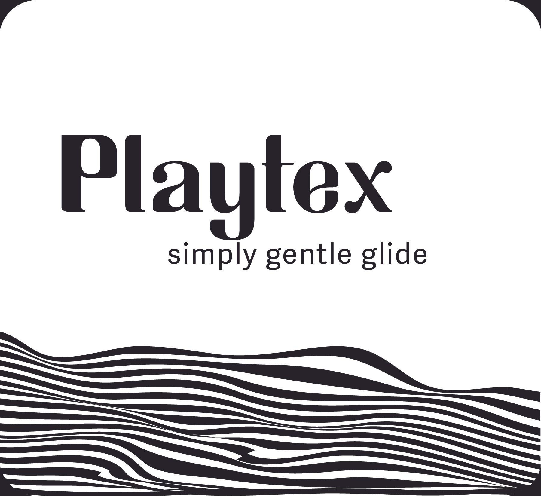
Round 2


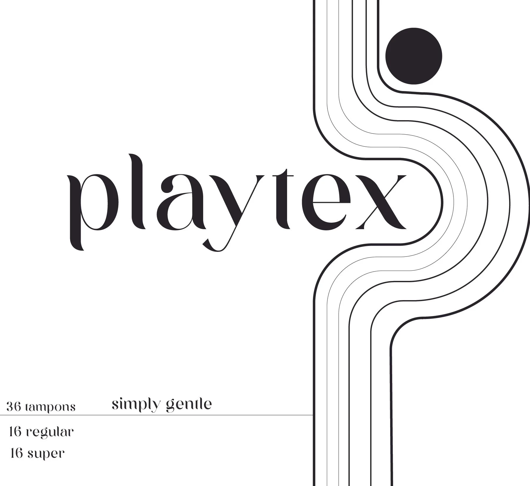
From these initial concepts, I delved into color exploration and continued refining my ideas. Keeping in mind my keywords—clean, calm, and elegant—I ultimately decided to proceed with the third option. This design not only aligned well with the desired aesthetic but also presented the menstrual cycle in a less literal, more abstract manner, which I found to be particularly effective.


Final Design


Mockups


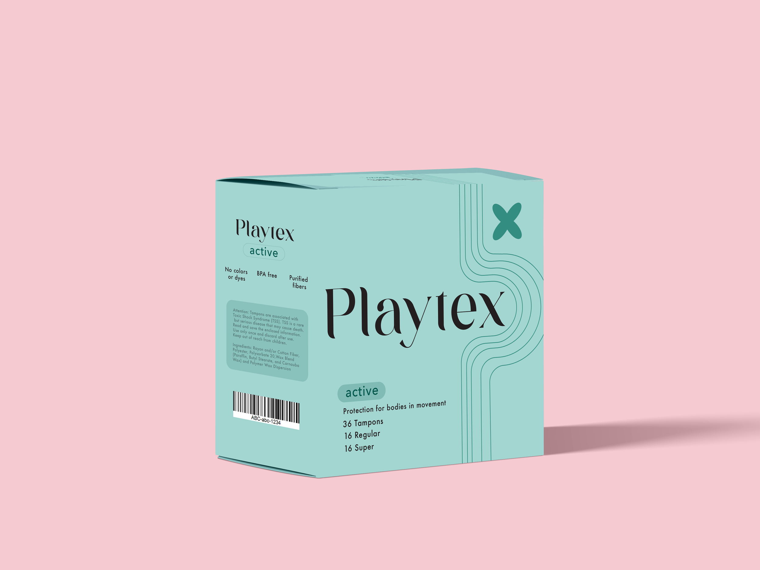
In my final design phase, I began contemplating ways to elevate the production process further, aiming to achieve even greater discretion in packaging. I envisioned wrapping the product in clear Polyethylene upon purchase, with all necessary consumer information printed on it. This outer layer could then be easily removed, revealing the discreet, clean packaging underneath. This approach would enable effortless display in the bathroom, blending functionality with aesthetics.


During this process, I learned a lot about packaging design and really enjoyed getting experience in giving a product a new look and sending a different message to customers. As I continue working on this product, I would like to see how I can further develop the idea of discrete packaging, creating ads and how I could improve the brand itself.
